
Download now. Sign up. Learn more.
All of these text phrases are call-to-action examples and could be used to encourage your audience to perform the desired action on the website. Which would be beneficial to your business.
CTAs play an important role in inbound marketing and can greatly increase conversion results. Strong and direct CTAs can motivate your customers to perform the desired action. Differently, weak or too aggressive CTAs can scare them away. This way increases your bounce and churn rates on the website.
However, what could be even more challenging is that many regular CTAs might not even work for your business. And rather than driving traffic to your site, it might scare people away.
As the result, you, as a business owner know your audience the best, their needs, and what motivates them. Thus in today’s article, we’ll cover the fundamentals of writing a perfect call-to-action. The one that captures audience attention, increases your conversions and builds the brand’s trust.
If it’s ain’t your first time reading over CTAs feel free to skip to the following section where share 5 simple tips to craft a perfect CTA that works.
And it doesn’t matter in which industry you operate, we can always learn something new from other businesses and notice what works for them the best. Hence, we’ll analyze 5 different companies and what CTAs work for them.
Lastly, in our Bonus Part, we’ll discuss how copywriting techniques can help you write better CTAs and spark your creativity to generate better ideas!
Call to Action Fundamentals
What’s a Call to Action?
To begin with, a call-to-action is a short text phrase that invites people to take a specific action on your website. CTAs can be in a form of a button, hyperlink text, or even used in the image format.
Call-to-action buttons are used to persuade website visitors to perform the desired action on your site that’s beneficial for your business.
For example, make a purchase, sign up for a newsletter, download software, or share your content with the rest.
However not all the CTA’s are equal to each other, and some of them are more powerful and persuasive. Contrastly some of them can be weak or even boring.
Lastly, not all the CTAs work equally the same and it can be that some of them just won’t work for your business. For example, it wouldn’t make much sense if for your paid SaaS product we would use the “Check it out!” button. Here it would be better to use “Try now”, or “Buy now” CATs.
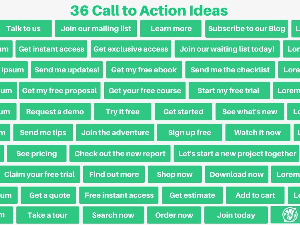
If you run out of creative ideas which CTAs to use, use the following examples for inspiration.
4 Different benefits to use them
Now you might ask, but what’s in it for me and how writing persuasive CTAs can be beneficial to my business.
Well, these are the 4 most common benefits:
- Build awareness. By directing people to your website you’re growing your brand recognition. This way people learn more about your brand, products, and services you sell.
- Generate leads. An effective call-to-action could be used to generate new leads and encourage people to sign-up for your email list. And growing your list can be a very powerful marketing technique for your business, because you’re the only one who has full control over your communication with your audience, and none of the other media giants has influence over it.
- Make a sale. It’s well-known fact that each time a new customer lands on your site it has to go through a sales funnel. First time learning about your brand and what products do you sell. To eventually become so accustomed to your brand that starts buying from you. As the result, an effective call-to-action could encourage customers to buy more from you. This way helps you to close more sales and increase the conversion rates.
- Direct path to your product. A clear and direct CTA on your site can help your customers to reach the desired destination within a single button click.
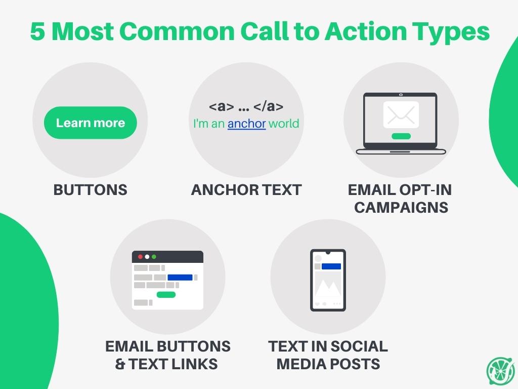
The 5 Most common Call to Action types
Whenever you create something for your audience to consume or download you expect them to go down your marketing funnel. As the result, adding a clear call-to-action of what to do next is a must.
And it’s doesn’t matter if you’re just writing an article or creating a Youtube video, call-to-action buttons can be anywhere. However, these are the most common 5 places you can find them online:
- Buttons on the website
- Anchor text in the blog post
- Email opt-in campaigns
- Buttons or text links in emails
- Text in social media posts
To better understand how to use them effectively to grow our business let’s quickly go through each of them.
1. Buttons on the website
Call-to-action website buttons are the most common placements. And without a doubt, each of us has seen at least one of them within the past few days. Because they’re just everywhere.
On the other hand, if done correctly it’s nearly impossible to miss them and they can truly ramp up your conversions. However, be sure to make them contrast with the rest of the background elements and stand out in color and size.
2. Anchor text in the blog post
This CTA format is the most common in blog posts and usually will appear as hyperlinks somewhere in the text.
Different from CTA buttons, anchor texts don’t stand out that much. This way anchor text doesn’t ruin the overall user experience and helps to improve it.
Use anchor texts to nudge your customers to read further on the following topic, read more in-depth, or even guide them to follow your brand on social media.
3. Email Opt-in campaigns
If you’re using any of the opt-in campaigns on your website such as signup pop-ups, sidebar boxes, or floating bars, you must get familiar with these types of CTAs.
But more importantly, your campaign’s copy must be incredibly good, catchy, and persuasive to convince people to join your list.
However, without an amazing copy, it’s important to craft a persuasive call-to-action that converts your visitors, to future customers.
Just think for a second, probably many of us are too busy reading long text copies and we’re always more tempted to click on catchy buttons with a clear value proposition.
4. Buttons or text links in emails
When someone joins your email list, you most likely will start sending them your marketing campaigns.
Thus having compelling CTA buttons in your email copy is crucial. Make sure that it’s encouraging people to interact with your brand and motivates them to go further down your funnel.
These different CTAs types can encourage people to:
- Read the full blog post
- Shop your products
- Download software
- Get your suggested freebie
- Sign-up for an upcoming event
5. Text in social media posts
Lastly, if you create content on social media you’re most likely aware of how important it’s to craft a compelling call-to-action on your posts and encourage people to act further.
Though depending on which social media platform you post the most, competition can get high and tense. Where each brand is fighting for your precious attention to their offer.
As the result, crafting a catchy, bold, and promising CTA in your social media posts is a must and can drastically increase your conversion rates.
5 Tips to Create an Effective Call to Action
When you write your CTAs, the language you use matters a lot. As discussed earlier try to craft something clear and right to the point. Something that from a first glance would be clear what to do next.
There are many different recommendations you can use to craft your CTAs, though keeping these 5 actionable tips can help you to boost your conversions.
1. Use action words
To begin with, call-to-actions should encourage your readers to act on something and perform the desired action.
Thus start them with a strong and clear verb that from a first glance could be clear what you should do next. Make them short and right to the point, before the customers lose interest to take the next actions.
- Do you offer consultation services? Use “Talk to us” CTA
- Running a 24/7 auto service that helps clients day and night? Maybe it’s ideal to use “Give us a call”
- Do you manage email list growth as some big media site? Then consider using “Join our mailing list”.
2. Talk to emotions
It’s a well-known fact that people bond better through emotional connection. The same principles apply to brands too. So why not use that while crafting your CTAs with emotional connection in mind?
And no, we’re not talking here about being manipulative and declaring unrealistic promises such as “lose 20 kg in 7 days” or “earn 1,000 dollars every single day without any effort”. Therefore focus on being more persuasive than manipulative and consider using any of these marketing techniques:
- FOMO – also known as fear of missing out it’s a popular technique used to encourage customers to act now and remind them that soon it can be too late. Probably many of us have seen these ticking timers on the websites that encourage us to take the action before it’s too late. Another popular method to encourage urgency is the scarcity effect, for example, “only 5 pieces left”, or “limited edition”.
- Herd mentality – another popular technique used to encourage people to act now is to show how many other people are already doing this and how much you’re missing out without being part of it. For instance, it could be something such as “Join our growing email list of 9,734 entrepreneurs!”. This results in people thinking twice about your offer. Because there are so many people who already signed up for this, maybe I’m missing out on something and shouldn’t ignore it?
- Provide value – craft enticing CTAs that provide value or promise something. However, be careful here and don’t overpromise. Keep in mind that it’s always better to underpromise and then overdeliver, rather than the opposite. Take an example from something like this, “Save 20 dollars on the first buy.” or “Get the best shovels in town for 45% discount!”.
- Build trust – the following one is a big one and building trust with your audience isn’t that easy. It takes a long time to build it and you can lose it in a single day. So take it seriously and build trust with your audience by choosing the right strategy, offering a warranty, include testimonials and case studies of happy customers. Do you have many 5 stars reviews? Make sure to show them off! Everything works here what demonstrates your expertise and being an expert within the field.
- Make it personal – it’s not a surprise that many of us are selfish creatures and prefer to talk about ourselves rather than to listen to others. Thus to craft, compelling CTAs consider using the first person in your language. Use phrases such as “I” and “me”, and get more personal with your audience. For instance, it can be something along the lines such as “I want my free ebook!” or “Sign me up to always growing list”.
3. Design it
In addition, always try to design CTAs to stand out from the rest and make them exciting to click. And no, you don’t need to have a degree in arts, and sometimes it’s just enough to do a quick search online to see what works and doesn’t. Nevertheless, if you don’t feel comfortable designing it yourself, hire a professional.
To design a compelling call-to-action button think over these key components:
- Color – different colors play an important role in our daily lives and can affect how we feel and react in different situations. More importantly, it can influence our behavior and make us buy. According to Kissmetrics study, nearly 90% of study participants confirmed that color alone influenced their purchasing decisions, so it shouldn’t be ignored. For instance, the red color increases your blood pressure, this way boosting a sense of urgency. On the other hand, the green color stimulates more relaxing emotions and can build trust.
- Size – button size is another important characteristic you should test. In short, make it is easy to see, but don’t create it too big which would destroy the overall UI experience of your site. The recommended button size is 44 x 44px.
- Shape – buttons can vary in different shapes and forms, can be round or pointy corners. The rule of thumb says that our brains avoid pointy corners, thus rounding up your buttons should theoretically increase your conversions. Of course, before making any further decisions, test it yourself and see what works for your case.
- Spacing – is the last important part to consider while designing your CTAs. In short, make sure that it stands out from the rest of the content, leave appropriate spacing around it to make it more visible and distinguishable from the rest of the background.
4. Placement
Finding the right place for your call-to-action buttons might be another challenge you face.
There’s a general rule that every CTA should be placed “above the fold”. That means placing your buttons on top of your page where your readers would instantly see landing on the site and won’t need to scroll down to act.
However, I wouldn’t completely agree with this suggestion for several reasons.
Today many different devices come with diverse screen resolutions. This means that your website will appear one way on some devices such as desktops, and completely different on other gadgets. As the result, it’s probably not possible to find a single place “above the fold” that would work on all devices equally.
Second, it’s important to reflect on your product’s cost and how expensive it’s for your customers. It’s a no-brainer to place CTAs inviting people to sign up for your newsletter. Because they don’t have to lose much.
On the other hand, placing an expensive product at the top of your page might instantly scare your readers away. The following products, which are usually sold later down the funnel, provide more value to your readers and why they need it. And only then gradually close it.
Just look at the example below, that tested how moving the CTA button to the bottom of the page increased the conversion rates by a massive 304%!
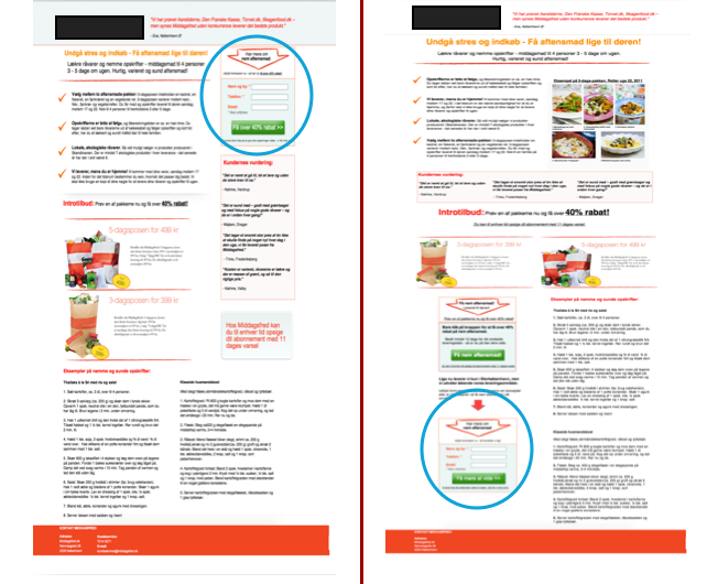
(Content Verve CTA placement experiment | Neil Patel Blog)
5. Test your Call to Action
The last step in writing a perfect call-to-action is to test your experiments and don’t rely only on your gut feeling.
You need to constantly test your CTAs among different versions and trust the data to make further optimization decisions.
Test different colors, sizes, placements, or even your text language, but don’t forget to test only 1 thing at a time, otherwise, it’ll be impossible to tell which element change improved your results. To effectively test different hypotheses use any of the split testing techniques.
5 Stunning Examples to Get Started
After we learned the key fundamentals to writing great CTAs and 5 easy steps to craft them more persuasive. It’s time to learn from the best brands at using them and how we can bring them to the next level.
Take inspiration from these 5 stunning examples and how these brands nailed their CTAs!
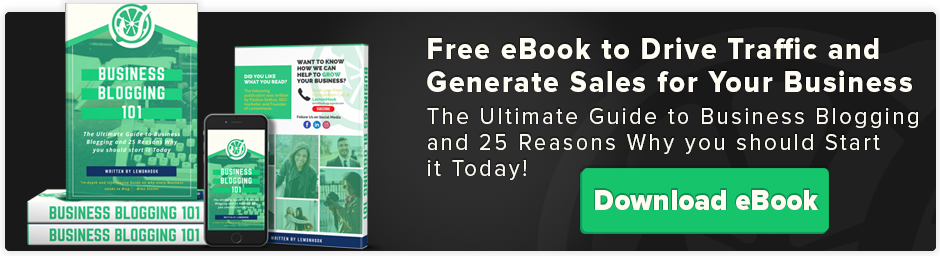
1. Inbound Marketing Agency
To start with, take a look at this example below from an Inbound Marketing agency and why it was so successful at converting visitors who stayed for 10 seconds on their site. Resulting in increased conversions by 5.75% respectively.
Notice 2 things from their form signup form:
- They told the users exactly what they’re going to get. And grey download button stands out from the rest of the background
- An alternative option doesn’t sound good. And the button blends more with the rest of the background which makes it harder to click
(Inbound marketing agency CTA | Inbound Marketing Agency)
2. Spotify
Music streaming giant Spotify surely knows what is doing and optimizes their website’s CTAs to perfection, leaving no one in doubt. You notice them instantly landing on their homepage.
Look at the following CTA below, and notice how the green color button instantly stands out from the rest of the background.
Also, the page instantly greets you with a value proposition that you can try millions of different songs without any credit card obligations or any other catch.
And closes with a direct and straight-to-the-point call-to-action “Get Spotify Free” encouraging people to try their services for free.
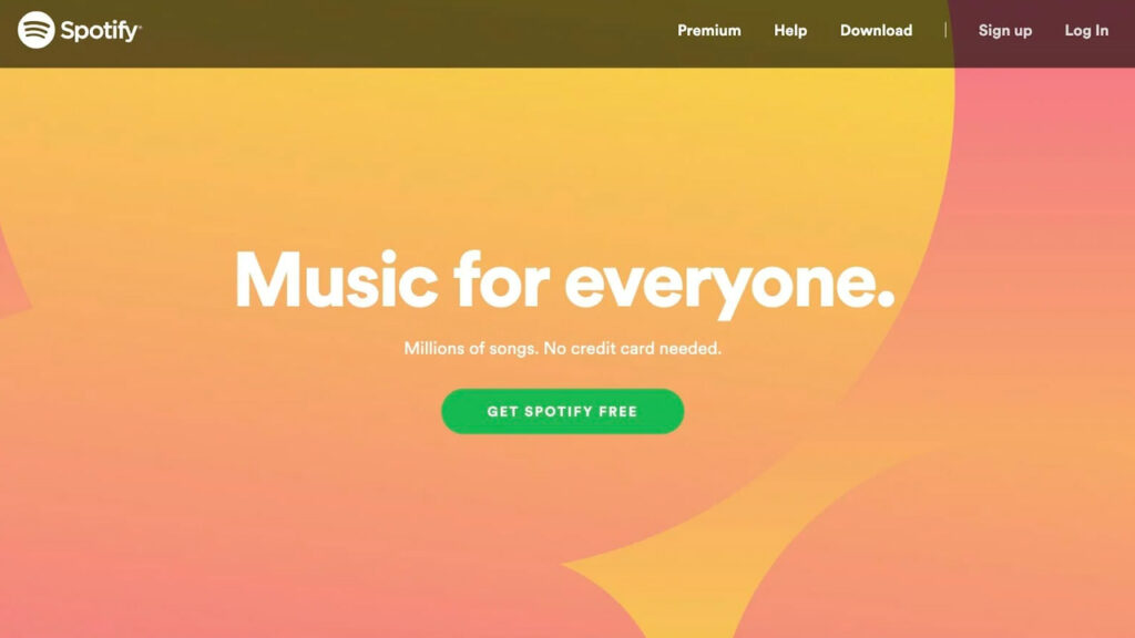
(Music streaming platform | Spotify)
3. Airbnb
Without a doubt, Airbnb was one of those many businesses that were hit hard during the COVID-19 restrictions period when the entire world shut down and people couldn’t travel anymore.
As the result, the brand had to quickly shift and develop new ways how to stay on top of mind and offer people alternative travel options.
As the result, check out this landing page that invites people for a relaxing stay at a nearby location and discovers places you haven’t thought about visiting before.
This smooth pasteles background immediately calms you down and greets you with a clear CTA that invites you to “Explore nearby”. Despite it being placed on the side of the page it’s still very noticeable and it’s hard to miss.
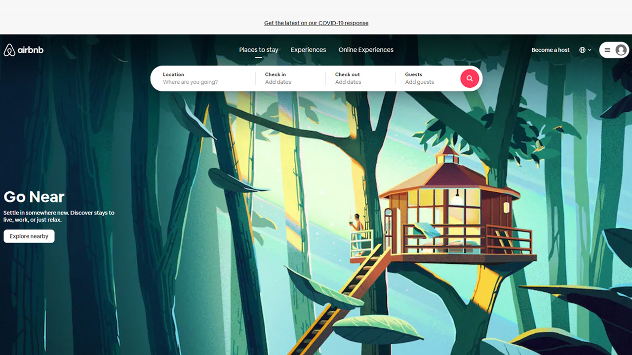
(Global homestay platform | Airbnb)
4. Singularity University
Singularity University hosts virtual summits helping entrepreneurs, organizations, and industries to grow.
One of their key challenges was to make sure that people registered for an event would show up.
As the result, they’ve created an amazing opt-in form that sets a reminder for the visitors about the upcoming event.
What stands out here is the extremely contrasting pink call-to-action button, which pushes color to its limits and it’s really hard to ignore.
In addition, clear and direct language “Remind Me!” leaves no one in doubt what this opt-in form is meant for.
And the results just talk by themself. Within launching this campaign Singularity University attracted 960 new leads to the following summit!
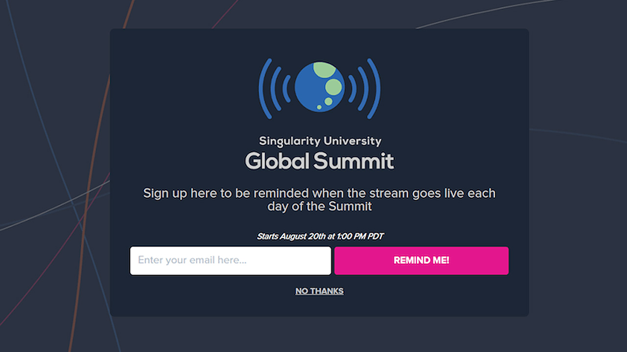
(Virtual summits for leaders| Singularity University)
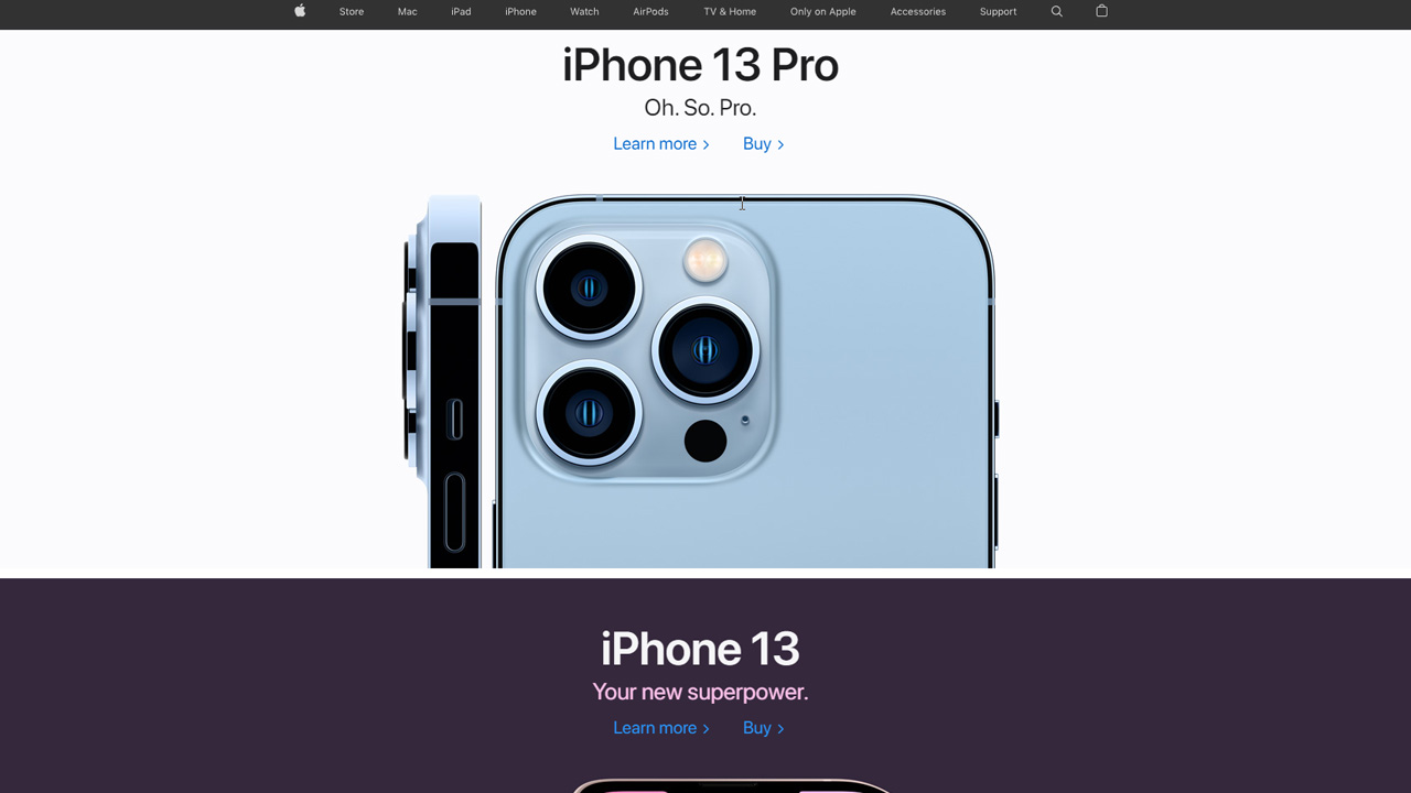
5. Apple
Apple was always famous for its simplicity to use. Each of their products is easy to use, understand and is always way ahead of its competition by design.
The same applies to their website too. Apple keeps clean and easy-to-navigate web design, clear and direct CTA that is short and straight to the point. Their hero image features their latest production and always gives 2 CTAs to choose from.
“Learn more” and “Buy” are 2 different CTAs encouraging people to visit their site in different customers journey steps and act depending on that.
Do they still need more information about the products or they are already ready to buy?
(Multinational technology company | Apple)
Bonus Point
How AIDA technique is beneficial to writing a great Call to Action?
It’s no surprise that crafting a compelling call-to-action button, its design has to do a lot with it. It’s important to consider the button’s color, shape, and size. Though next to that, it’s important to write a persuasive copy, that would be short, bold, and straight to the point.
Next to many other copywriting techniques that could help write our CTAs, the most popular one is AIDA.
AIDA stands for Attention, Interest, Desire, and Action. Let’s quickly discuss how it can be beneficial.
Attention
Create CTAs grabbing your audience’s attention, which are bold, and provoking curiosity to click on. Some of the most common examples are: “Buy now”, “Limited time offer”, or “Grab the template!”
Interest
As it sounds from the name, and interest-based copy should engage your reader and pique his curiosity to check out your content. Using this technique share various customer testimonials, interesting facts, or hidden secrets to peak their curiosity and encourage them to click. Here’re some of the examples: “Add to wishlist”, “Learn more”, or “Sustain our mission”.
Desire
While using a desire as a motivation to craft compelling CTAs think of it why people should take the next action and talk more about the benefits, rather than your product or service. Using motivating language try to persuade them to take the next action and spark their interest to claim your offer. Among examples are: “Send me the cheat sheet!”, “Lose 10kg in 15 days”, or “Learn English in 1 month”.
Action
The last one can be quite direct and sometimes even too aggressive. As the result, this type of CTAs should be better used somewhere further down the marketing funnel and approach people that are already prepared to make a purchase. Nudge your potential customer to take the next steps with phrases such as: “Download now”, “Subscribe to our newsletter”, or “Add to cart”.
Conclusion
To summarize, writing a persuasive CTAs wouldn’t happen overnight and it will take some time to learn all the subtle techniques and find out what works the best for your business.
Use effective CTAs to build brand awareness, generate leads, direct path to your product, and close the sales.
Call-to-actions can come in different forms and the most common are: buttons, anchor texts, email opt-ins, and text in social media posts.
To write a persuasive CTAs follow these 5 simple steps:
- Always start with an action word, such as verbs: “Get”, “Learn” or “Buy”
- Connect through emotional connection. Use techniques such as FOMO, herd mentality, and build trust by showing off your latest expertise
- Take a moment to design your CTAs to be attractive and catchy to click. Think over their design color, shape, size, and spacing
- Depending on how expensive products or services you sell, think over CTAs placement on your site. If you’re selling something cheaper, place your CTA above the fold. On the other hand, if you’re selling something more expensive, consider moving them to the end of the page
- And lastly, don’t rely on only your gut feeling when choosing which design to use, test, and record your findings. Always test 1 element at a time and never stop experimenting. Cause you never know which will be the winning element
Sometimes it’s not everything about designing visually appealing CTAs and it’s important to think over the copy too. For this, you can always fall back on using various copywriting techniques such as AIDA. This way making your CTAs more effective.
And lastly, if you run out of creative ideas about what CTAs you should try next, don’t hesitate and always take a sneak peek at your competitors and what they’re doing right. Use tools such as Wayback Machine and record how their call-to-actions changed over time. If the same buttons remained for quite some time, it means it’s working and might be worthwhile to try them for your business too.