In a perfect world, every business should strive to increase their traffic, sales, and leads on their website, though only a small portion of them understands how to do that correctly. That’s where the importance of A/B testing comes that allows your business to test your online content optimize it for better returns.
Unfortunately, that’s not a practice many businesses do. Even worse, many of them believe that’s just enough to create a pretty website, and from time to time update its design to look fresh.
However, that’s not the case and to maximize your returns all your online content should be constantly optimized and tested.
So the real question is. How do we optimize our website without spending a fortune on it or even worse, breaking the site?
Another reason why A/B testing is ignored is that many businesses believe it’s too technical or complicated. However, that’s not accurate and with today’s tools, it’s ain’t that complicated anymore.
Thus in today’s article, we’ll cover all the basics you need to know over A/B testing and how to apply these powerful techniques to optimize your business.
We’ll answer what’s the difference between A/B and Multivareance testing and how to set up them effectively.
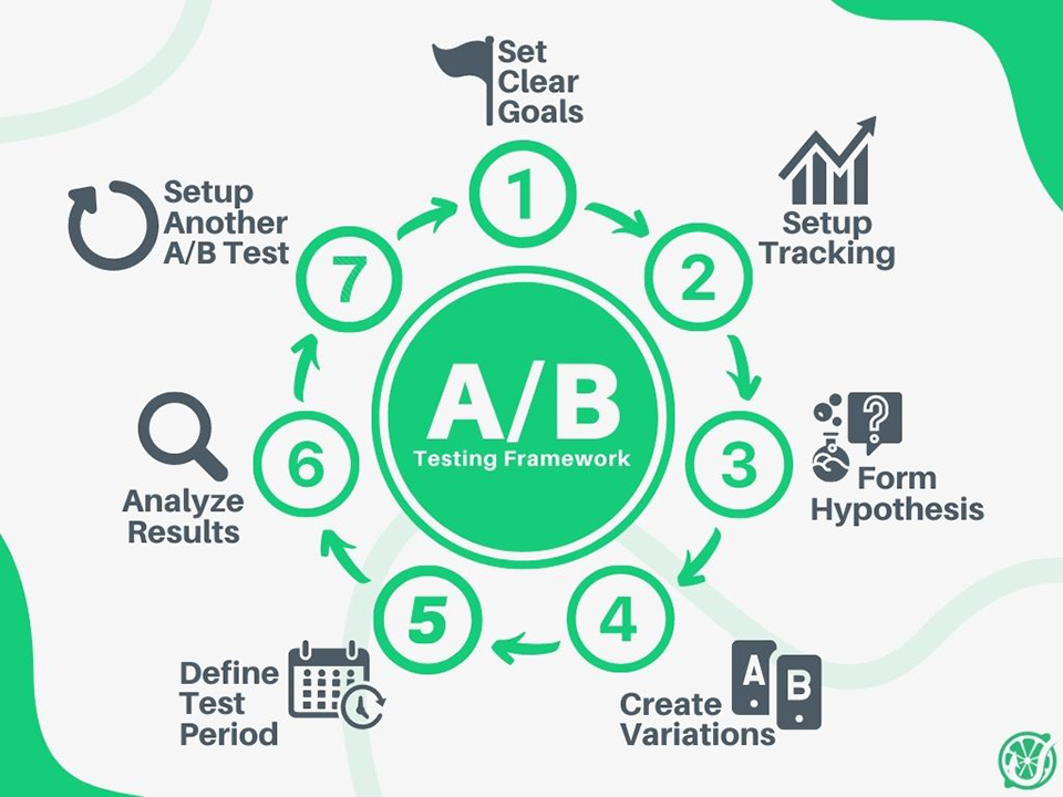
And that you won’t feel lost when working on your split testing campaigns we’ll share 7 simple steps to A/B testing.
Lastly, in our bonus part, you’ll hear over some truly inspiring A/B test campaigns. So stay tuned!
A/B Testing Basics
What’s A/B testing in marketing?
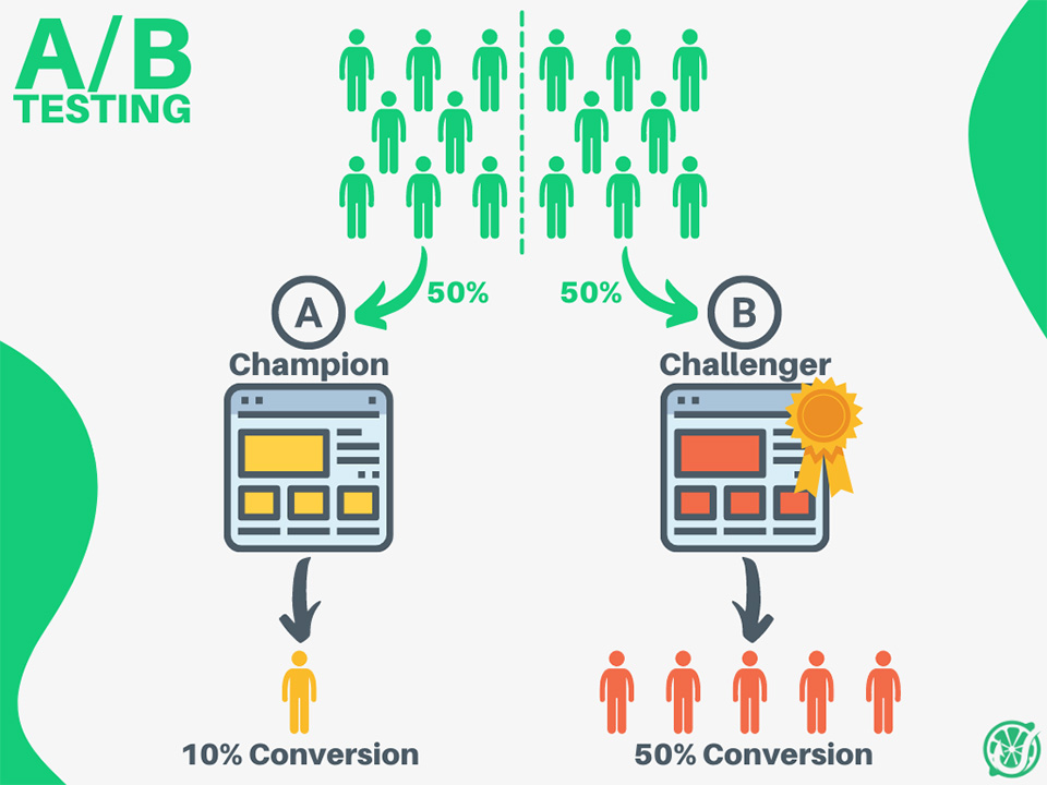
A/B testing or better known as split testing is a marketing technique used to optimize your online content based on various experiments. To run the experiments divide your website traffic into two equal parts and show them different versions of your content.
Let’s say that you want to test out your new purchase button color on your website. The current green button doesn’t deliver well. So your marketing team decided to run several experiments to see how different button colors could affect the conversions.
Here, the green button will be our test version A or better known as the champion item.
And our test variation, the red button will be our B version or better known as a challenger item.
Once you set your champion and challenger items, the A/B testing tool will divide your traffic into 2 parts and randomly send it to different test variations. After some time, you’ll start gathering some valuable data and see which items perform the best. Lastly, once you gather a sufficient amount of data it’s up to you, to further run your experiments or change your items and remove the losers.
Using split testing you could test various marketing materials, from your Ad layouts, different landing pages, or email marketing campaigns.

What’re the benefits?
A/B testing plays an important role in marketing, helps to optimize your business, and can make or break it. Just think for a second, you probably wouldn’t run your business that long if you would be constantly losing money. One of the main reasons is your website generating not enough conversions.
More importantly, split testing helps your business eliminate the guesswork by making data-driven decisions in optimizing your processes online.
Next to that, it’s beneficial for several other reasons:
- Increased conversion rates – split testing is one of the most effective ways to optimize your business conversions and deliver a higher return on investment.
- Better know your audience – running more experiments allows you to see how your audience is interacting with your business. And this is really valuable information that allows you to better understand your audience, their habits, and needs.
- Reduce bounce rate – A/B testing helps your business to find the content that your audience likes the most. The more they’ll be engaged with your content the longer they’ll stay on your site. As the result, reducing your bounce rates.
- Stimulate innovation – it’s ain’t easy to stay on top of the latest marketing trends, because they’re constantly changing. As the result, split testing eliminates the guesswork of what might work or not. This way testing different marketing trends and techniques.
A/B vs Multivariance Testing
In the conversion optimization world, there are 2 main testing methods, A/B and Multivariance Testing.
A/B Testing samples 2 different items among each other, in other words, the challenger is being tested against the champion item.
In contrast, Multivariance Testing samples more than 2 items against each other at the same time.
For instance, the latter could be testing the hero image, call to action button, and the header text at the same time.
However, differently from A/B Testing, it’s much harder to prove Multivariance Testing results. Because it’s difficult to say which changed items drove increased the conversions. Was it the button color change or different hero image that lead to more traffic?
What to Test?
In addition, there are no boundaries to what you could test on your website and optimize for better results. And pretty much what you can change you can test.
Though that doesn’t mean you should be testing every small thing on your site and rather focus on low-hanging fruits that would deliver the best returns. And before each testing experiments think over the 80/20 rule and focus on the items that generate the highest returns.
On the other hand, while optimizing your website, you may test:
- Call to action buttons size, placement, and color
- Headlines size and placement
- Different body texts
- Different titles
- Hero images
- Screen graphic elements
- Contact forms and the number of required fields
If we talk about testing other types of content you can optimize your email deliverability, try different copy layouts or email designs.
Lastly, think about testing your paid ads, such as text ads. Test different headlines, change the copy. If you’re testing display ads, try different visuals or layout designs.
A/B Testing process
The split testing process isn’t that easy as it might sound from the start and it’s easy to get overwhelmed with too much test data. However, with great planning and a clear goal in mind, it should be much easier.
1. Set a clear goal
Before beginning your tests, start with a clear goal in mind and define what do you want to test.
The common goals are to increase the website’s traffic, generate more leads such as newsletter signups or more sales. In other words, optimize your conversions.
However, if your business is still new you might not have enough data to back up your tests, and conversion optimization might be not optional.
In this case think of optimizing your click-through rates (CTR), or bounce rates. Metrics that show how likely people are staying on your site.
2. Setup tracking
To track your test results, set up an analytics tool on your site.
Google Analytics is a free and powerful tool to track your website’s data, including conversions. As the result, once you set up analytics, define clear goals and what success means to your business.
That will help you to see the effectiveness of your campaigns and stay on track with your progress.
3. Form a hypothesis
After you set up your goals and tracking is in place, it’s time to generate your hypothesis. In short, it’s the initial guess as to why you think some changes to your website could improve your business conversions.
For instance, you might think that offering something for free for signing up in your newsletter could increase your conversion rates rather than asking for information without anything in return.
Once you’ve come up with your hypothesis put that down on a piece of paper or document it elsewhere. That’ll help you to focus your attention on the objectives and will make won’t forget them.
4. Create variations
Furthermore, it’s time to create different item variations you want to test during your experiments.
To create them use one of the many A/B testing tools and proportionally test them against each other.
Many of these tools have visual editors that easily allow you to update your content variations. For example, changing the color of your buttons or swapping the order of your website elements hasn’t been never easier before.
Some optimization tools such a Google Optimize is free to use. And if you just starting your conversion optimization journey it will be more than enough to match your needs. Once you’re ready to step up your game, use other advanced tools that come with various cool features such as heatmaps, session recordings, or users testing. Consider these:
- CrazyEgg
- Optimizely
- Qualaroo
- HotJar
- Clicky
After test variations are done, the tool will take care of the rest, will divide your traffic, randomly assign different test variations, and will start gathering the data.
5. Define the testing period
After your experiments have been set, it’s time to define your test period, start date, and how long you should run it.
Unfortunately, there is no one answer to how long you should run it because that highly depends on the amount of traffic you get on your site. The more people visit your place the shorter tests you could run. On the other hand, the average test experiment lasts somewhere between 2 weeks and 2 months.
Next, the project timeline highly depends on how long it will take you to reach a statistical significance. In other words, this metric helps you to determine if your test results were due to a chance or they’re confident enough to prove it.
As the result, the higher your statistical significance is, the higher chance that your test results are working. If you get somewhere between 70-95% you can be quite confident over it. On the other hand, if you get below 69% your confidence drops and it means you should run them longer. Consequently, don’t make any conclusions yet, until you’ll gather more data.
To find out statistical significance using one of many free online tools such as the one from Neil Patel.
6. Analyze results
After running your tests for some time, from time to time analyze your results and see how well your different items performed.
Use statistical significance measurement to decide if your results are sufficient, or you should continue running them further.
After that, compare the results inside the test tool, and analyze the number of conversions you get. Eventually, decide how these results help you to achieve your business goals.
If you’re happy with your experiment and your challenger performed better than the current item, consider changing them and eliminating the poor performer.
7. Rinse & repeat
Split testing shouldn’t be a static process and once you’re done with your experiments don’t stop it here. There’s always you can do something to increase your conversions on the site.
As the result, A/B testing in marketing should be a continuous process and once you’re done with a test cycle think of what else you could improve and repeat the test cycle.
Remember that your website shouldn’t be a static page and you should be continuously optimizing it for better returns.

Bonus Point
3 A/B testing examples
It can be that sometimes you will run out of creative ideas what to test further. As the result, to get inspired for your next mission we’ve compiled for you several experiments with some truly remarkable results.
1. Green or Red button?
Testing your CTA button’s color on your landing pages is probably one of the easiest and popular tests to try.
No surprise that the following experiment has been tried many times over and over again. Though the one that stands out was performed by marketing automation giant HubSpot. It’s not a secret that HubSpot constantly runs thousand of different experiments to optimize their conversions.
The initial idea was to find out which CTA button color generates the most conversions on Performable’s website. The original green button better matched the overall aesthetics of the website. In contrast, the challenger red button was more contrasting against other site elements and asked for more attention.
It’s important to mention that the rest test items were left as it is. And only a single test item has been tested.
Surprisingly after several days of the experiment interesting results have shown up. The red button outperformed the green one by 21%!
That means, that 21% more people clicked the red button, resulting in an increased amount of traffic going down the sales funnel and performing other desired results.
Though, keep in mind that HubSpot said these results shouldn’t be fully generalized and consumed with precaution. Because these results could be achieved for certain conditions in which they occurred and could have been influenced by the page’s design or the audience that viewed it. Thus your business might not get the same results as HubSpot did it.

(Green vs Red CTA button color experiment | HubSpot Blog)
2. Ask your Audience
Split testing is not only about running experiments using the A/B testing tools and sometimes you’ll get the best answers by asking your audience directly. Ask them what they think about your business and what could be improved.
That’s exactly what Groove’s marketing team did while optimizing their landing page. After running some failed experiments online they couldn’t figure out why their conversions rate was so low, only 2.3%. That’s when they’ve decided to go a step further and began their optimization journey.
They’ve looked up various resources online, asking experienced marketers, but nothing was as helpful as they’ve expected. Later, they’ve reached out to their current users and asked them what was wrong with their website and why they didn’t proceed further with the sales funnel.
And Bingo! After the experiment, they’ve figured out that the key problem wasn’t their website’s design, but it was their copy. Many customers haven’t converted because the messaging wasn’t right, felt cold and unfamiliar.
As the result, they’ve focused on optimizing their copy first and only then taking updating its visual part.
And guess what? The test results have doubled after the update and now, instead of low 2.3% conversion rates, it increased to 4.7%. That made their audience happier about the brand and company increasing in more conversions.

(Groove’s landing page optimization case study | Groove Blog)
3. Frontpage banner – valuable real estate
Frontpage banners take a huge spot over your website’s homepage space and are a valuable real estate place to get your customer’s attention. That’s why ignoring its potential would mean wasted resources and possibly lost on new prospects.
Healthcare insurance provider Humana understood the importance of front-page visuals and wanted to optimize their banners for the highest results. That’s why they’ve run several experiments and tested their current homepage banners among several other versions.

(Humana banners experiment case study | MarketingExperiments Blog)
That’s where the initial version of Humana’s frontpage banner has felt short and didn’t perform well for several reasons.
It had too much text copy, no strong call-to-action button and it didn’t have clear and concise messaging.

(Humana banners experiment variation 01)
For their challenger banner first version, they went for a cleaner design, less copy, and a strong clear call-to-action button.
The results. Staggering 433% increase of clickthrough rate!
Though, the health insurance provider didn’t stop here and further continued the experiment.
Choosing a new health insurance provider could be done only once a year and only during a short time. The customers have to act quickly when switching to a new provider.
That’s where Humana decided to try out a different type of messaging, more suitable for hard-selling methods and more often seen in the later stages of the sales funnel.

(Humana banners experiment variation 02)
As the result, they’ve changed their headline messaging from ‘Explore’ to ‘Shop’, their call-to-action button color, and messaging asking for more action.
Results? That added another 192% of clickthrough rate increase and only proved that their hypotheses were right and new call-to-actions were better-matched customers motivation.
Conclusion
In conclusion, A/B testing is a long-term marketing technique that helps to optimize your business conversions. With clear goals, dedicated planning, and tools on hand your split testing journey will be much easier.
Despite that sometimes, A/B testing can be quite a time-consuming process, it shouldn’t be ignored and is beneficial for the following reasons:
- Increased conversion rates
- Provides more information over your audience and their habits
- Reduces the bounce rate
- Stimulates innovation to look for new ways how to optimize your business
And it can be that sometimes you get overwhelmed with too much data in your testing process. As the result great planning is essential. Thus these simple steps will assist you to prepare better for your experiments:
- Set clear goals
- Setup analytics tracking
- Form a strong hypothesis
- Create A/B test variations
- Define the testing period
- Analyze results
- Rinse & repeat
And lastly, split testing should be a continuous process within your internal processes and if it happens so that you run out of test ideas, always look up inspiration online. Research what other popular brands are testing and get inspired from the best reading their test cases.


